
Interior PrivateJanuary 23, 2023
Ruggan
Location
Lightwater, UK
Type of Project
Branding + Website
Duration
7 Weeks
Client
Ruggan.com
Key Challenge
Encapsulating the essence of the rugged, adventurous spirit of its clientele while elevating the perception of beard care from a mundane routine to an art form. Ruggan needed to stand out as a beacon of quality, authenticity, and dedication to the craft of beard maintenance, all while communicating the effectiveness of its natural ingredients and the lifestyle it embodies.
00. Project Description
Embarking on the Ruggan project was an opportunity for BNDesign Studio to dive into the vibrant and growing market of beard care products.
Ruggan, a brand dedicated to the artistry and care of beards, approached us with a vision to craft an identity that resonates with the modern, discerning man.
Our challenge was to encapsulate the essence of Ruggan's all-natural, premium quality products through a branding and digital experience that speaks directly to the refined yet rugged individual.
This project was not just about creating a look; it was about forging a connection with the bearded community, celebrating the lifestyle and dedication it embodies.
The primary challenge presented by Ruggan was distinguishing the brand in a market flooded with generic grooming products.
The beard care industry is characterized by a deep sense of community and individuality, yet many brands fail to address the unique needs and values of their audience.
Ruggan sought to break through the noise with a brand identity that genuinely reflects the craftsmanship and authenticity of its products, while also establishing a strong online presence that educates and engages.
The task at hand was to design a solution that not only highlights the natural and bespoke nature of Ruggan's offerings but also fosters a sense of belonging among its users.
Crafting the Essence of Beard Perfection

01. Research
Crafting a digital cornerstone for IT automation leadership.
Our initial phase of research involved a deep dive into the IT automation industry, competitor analysis, and current digital trends to understand the landscape Access IT Automation operates within.
Through surveys, user behavior analysis, and stakeholder interviews, we uncovered a clear need for a platform that not only informs but also engages and converts potential clients.
Insights revealed a demand for intuitive navigation, detailed service descriptions, and accessible contact channels, emphasizing the importance of a seamless user experience to foster trust and credibility among enterprise-level clients.
Based on our comprehensive research and insights, we proposed a solution centered around a complete overhaul of the Access IT Automation website.
The redesign would focus on a clean, modern aesthetic with enhanced usability features, including a restructured service portfolio, interactive case studies, and a streamlined user journey.
This approach aimed to position Access IT Automation as a thought leader in IT automation by providing a resource-rich platform for potential clients to explore solutions, gain insights, and initiate contact effortlessly.

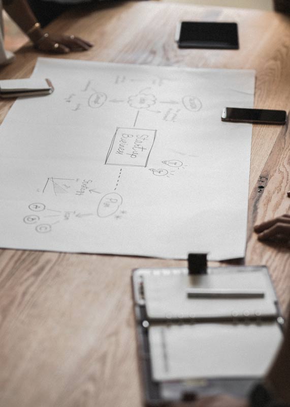
The concept phase was geared towards translating our research and solution idea into a tangible, actionable plan.
This involved mapping out the user experience, defining the visual language, and identifying key functionalities that would distinguish the Access IT Automation platform. By leveraging modern design principles and focusing on user engagement strategies, we aimed to create an immersive digital environment.
Interactive elements, dynamic content, and a mobile-responsive design were prioritized to ensure accessibility and relevance across all user touchpoints.
The blueprint outlined a phased implementation strategy, starting with core pages and gradually expanding to incorporate advanced features like AI-driven support tools and personalized user dashboards.
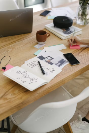
02. Conceptual Blueprint
Envisioning a user-centric portal for transformative IT solutions.
03. Prototype and Test
Transforming insights into action for unparalleled user experience.
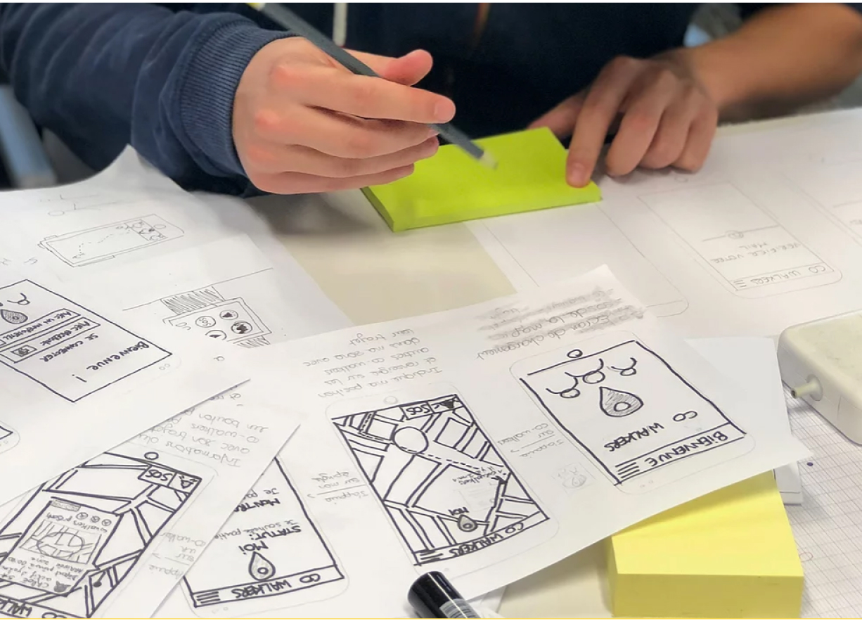
Once the conceptual blueprint was established, we transitioned into the prototype phase, where ideas began to take a tangible form.
Utilizing tools like Sketch and Figma, we crafted an interactive prototype that mirrored the proposed design and functionality enhancements. This prototype served as a visual and navigational mock-up, enabling us to explore the user experience in a controlled environment. Key features, such as the service portfolio navigation, interactive case studies, and the contact pathway, were developed to closely simulate the final product, providing a comprehensive preview of the redesigned AccessITAutomation platform.
The prototype underwent rigorous testing with a diverse group of users, including IT professionals, potential clients, and internal stakeholders.
This testing phase was crucial for gathering authentic feedback on usability, design appeal, and content clarity. Utilizing methods like A/B testing, user journey mapping, and direct interviews, we were able to identify areas for refinement and enhancement.
The insights gained from this process informed iterative adjustments to the prototype, ensuring that the final design would not only meet but exceed user expectations and requirements.
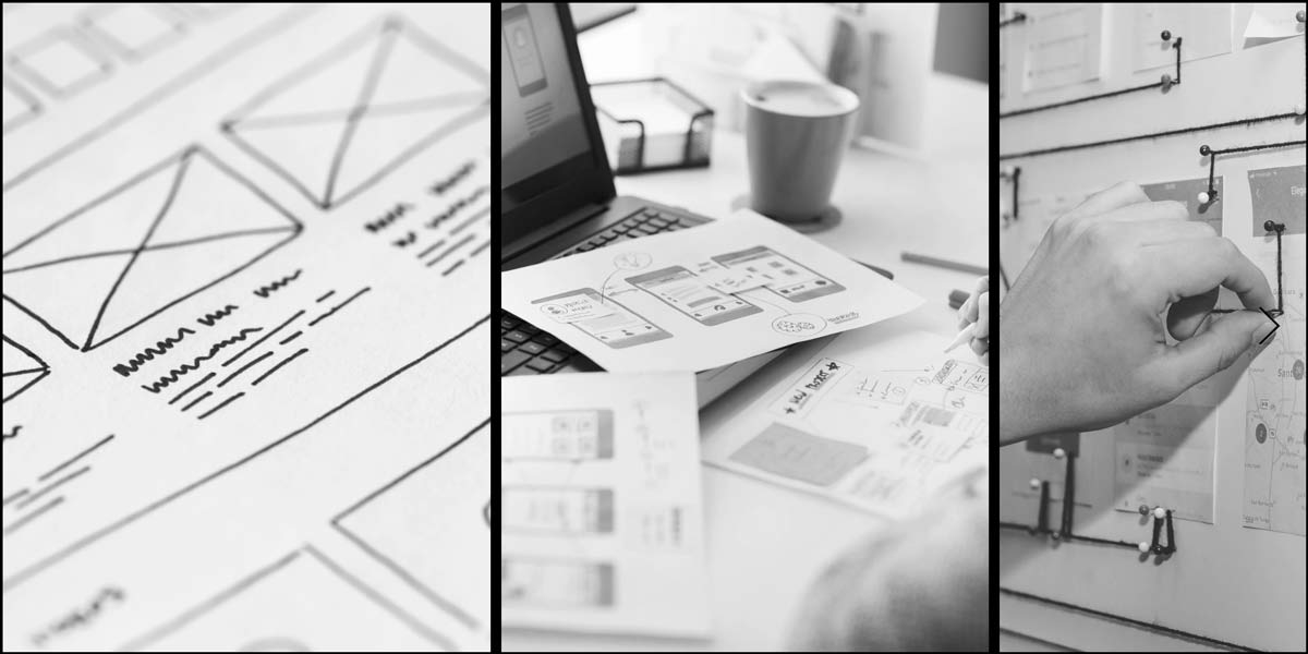
The Iterations phase was a dynamic period of refinement, where feedback from the prototype testing was meticulously applied to enhance the design and functionality of the Access IT Automation platform.
Each iteration was approached with a problem-solving mindset, focusing on optimizing the user experience, streamlining navigation, and enriching content for better engagement and comprehension. Through a series of agile sprints, the project team collaborated closely, making data-driven decisions to fine-tune visual elements, user interface components, and interactive features.
This iterative process not only improved the platform's usability and aesthetic appeal but also ensured that the final product would effectively meet the complex needs of Access IT Automation's diverse user base.
04. Iterations
Evolution through agility: Perfecting the platform with each iteration.

01. Build and Delivery
From Nature to Nurture: Unveiling the Ruggan Revolution.
The crafting of the digital platform that embodies the brand’s ethos of natural, premium beard care. Our approach was holistic, focusing on an aesthetic that mirrors the artisanal quality of Ruggan’s products, complemented by a user-friendly interface that invites engagement and exploration.
We integrated e-commerce functionality with educational content, creating a seamless journey from discovery to purchase.
The launch of Ruggan’s website and branding wasn’t just about bringing a new product to market; it was about establishing a beacon for beard care enthusiasts, a place where the modern man's grooming needs are met with expertise and care.
Colours
In developing Ruggan’s visual identity, we chose a color palette that reflects the brand’s core values of strength, vitality, and natural quality.
The foundation of our design is set upon a dark, enigmatic background (#202020), named “Midnight Canvas,” which evokes the depth and mystery of the night, providing a sophisticated backdrop that highlights the richness of the beard care ritual.
Against this, the energetic accent of “Amber Glow” (#E86B17) injects a burst of vitality and warmth, symbolizing the life and vigor that Ruggan products bring to facial hair. For text and other critical elements, we utilized “Mist White” (#EFEFEF), a crisp and clean contrast that ensures legibility and draws the eye to key information.
Together, these colors create a striking and inviting aesthetic that mirrors Ruggan’s dedication to quality, allure, and the spirited lifestyle of their clientele.
From vision to reality: Launching a new era of IT automation.
PRIMARY COLOR
Amber Glow
#E86B17
RGB 232,107,23
PRIMARY COLOR
Mist White
#E86B17
RGB 239,239,239
PRIMARY COLOR
Pastel Green
#74D978
RGB 116,217,120
PRIMARY COLOR
Pastel Green
#74D978
RGB 116,217,120
PRIMARY
COLOR
Midnight Canvas
#202020
RGB 32,32,32
Logo
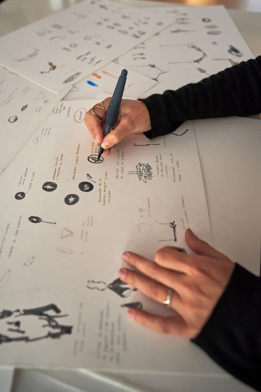
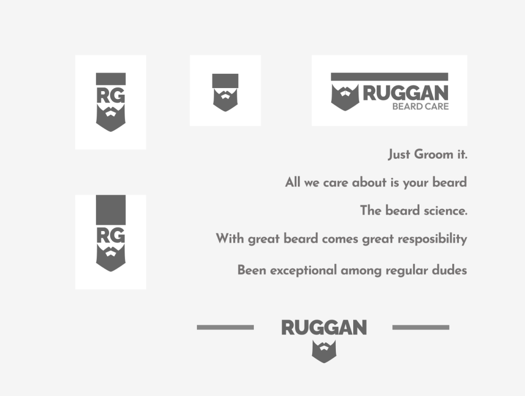
The Ruggan logo is a charismatic portrayal of the brand’s essence, centering around the rugged yet refined image of a bearded lumberjack.
This emblematic figure, with its full, meticulously groomed beard, captures the spirit of the modern man who takes pride in his appearance and the natural health of his beard.
The detailing ensures the logo remains bold and visible across various applications, from digital platforms to physical products. This logo does more than just mark the brand; it invites a connection, resonating with those who see beard grooming as an essential, enjoyable part of their lifestyle.
Through this design, Ruggan communicates its commitment to quality, natural ingredients, and the celebration of masculinity in its most authentic form.
Website
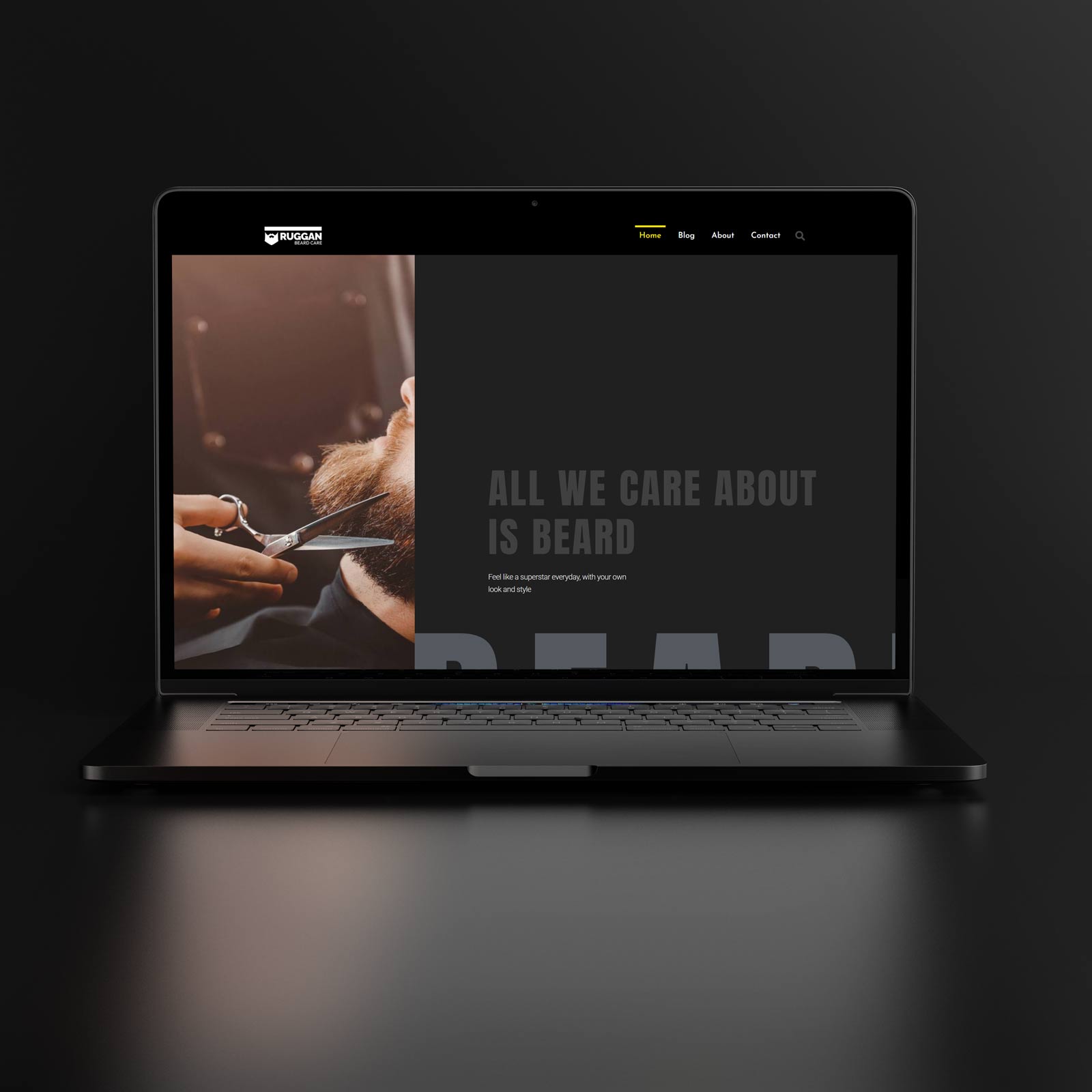
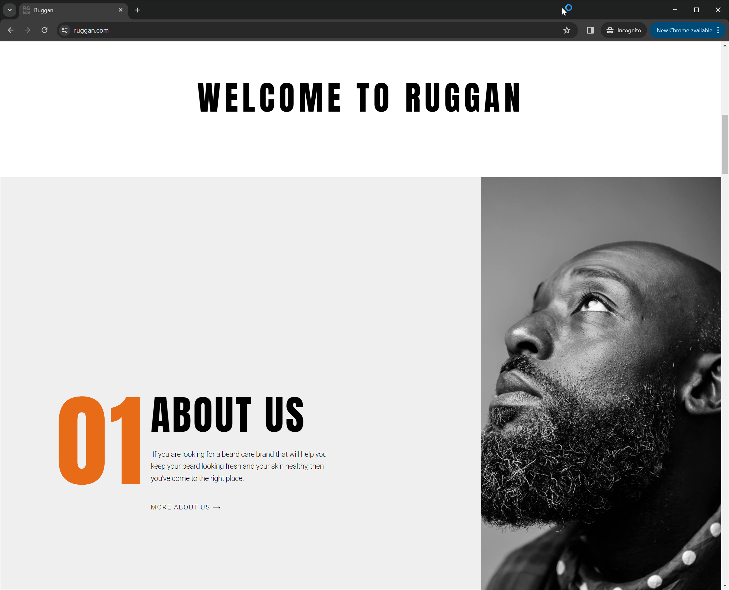
The Ruggan website is a masterclass in balancing simplicity with impactful design on a dark, inviting canvas.
Against the “Midnight Canvas” (#202020) background, the website unfolds as a modern homage to the beard and the lifestyle it represents. By utilizing a minimalist approach, each element on the site — from navigation to product showcases — stands out in stark, beautiful contrast, thanks to the judicious use of the “Amber Glow” (#E86B17) for accentuating key features and calls to action.
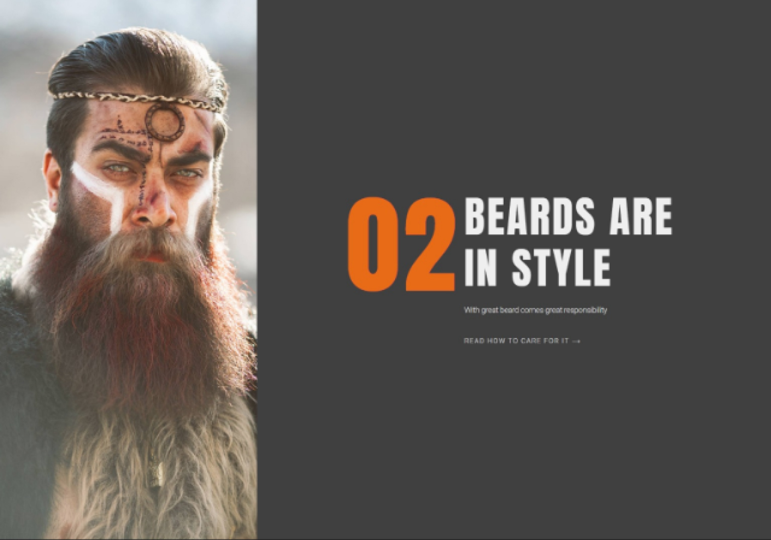
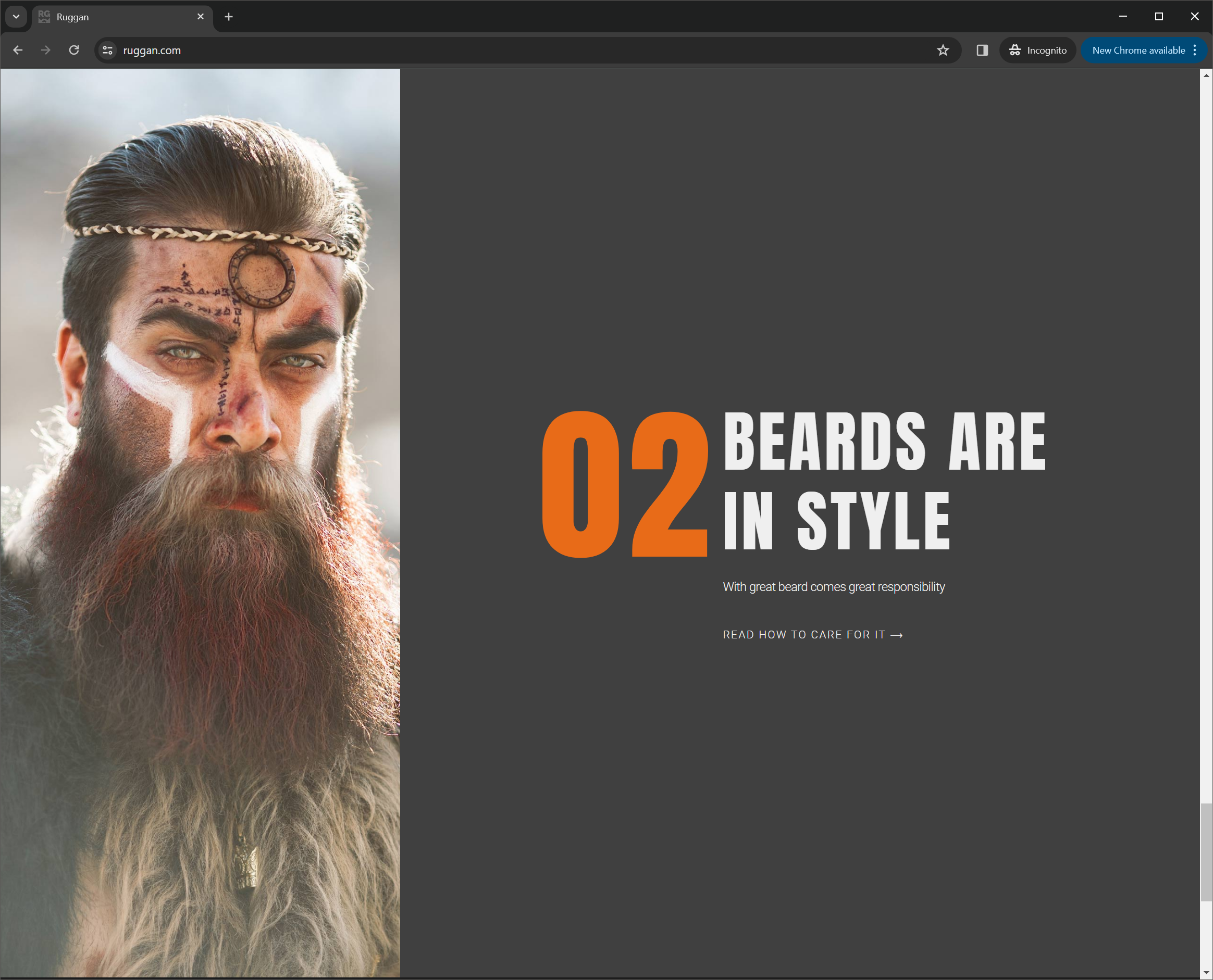
Large, captivating images dominate the visual landscape of the website, featuring men with impressively groomed beards set against breathtaking mountainous backdrops.
These lifestyle photographs are not just decor; they are declarations of the Ruggan ethos, portraying the adventurous spirit of the Ruggan man. They serve to inspire and connect, creating an aspirational world where the beard is not just facial hair, but a symbol of wild, untamed freedom and refined elegance.
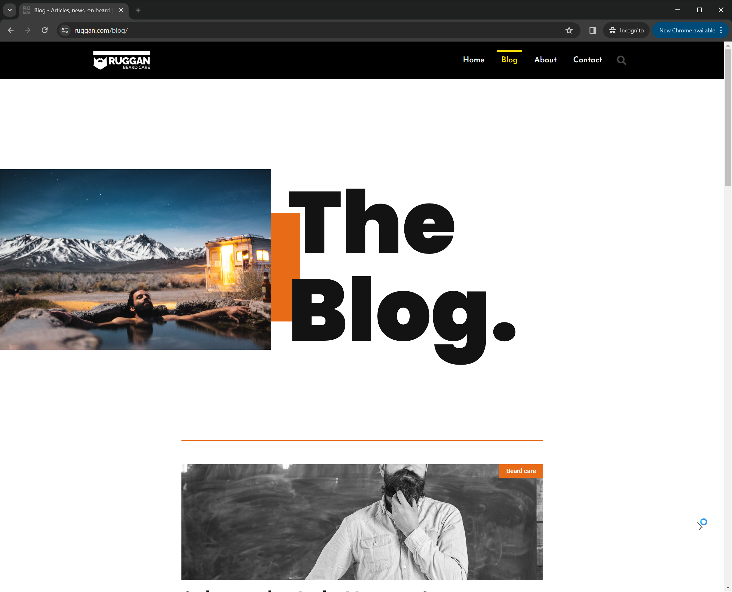
The blog section is a cornerstone of the website, meticulously curated with educational content that goes beyond the surface. From tutorials on beard care to deep dives into the benefits of natural ingredients, the blog positions Ruggan as not just a brand but a comprehensive guide for the modern, bearded man.
This educational platform is crafted to engage and inform, empowering users with knowledge on how to nurture their beards and embrace the lifestyle fully.
In essence, the Ruggan website is a digital bastion of masculinity and nature, designed to resonate with the rugged yet refined individual. It’s a place where users are not just visiting a website but stepping into a world that celebrates the artistry of beard grooming and the majestic beauty of the natural world.
Through its strong design and contrasted elements, it invites visitors to explore, learn, and become part of the Ruggan legacy.

Product design
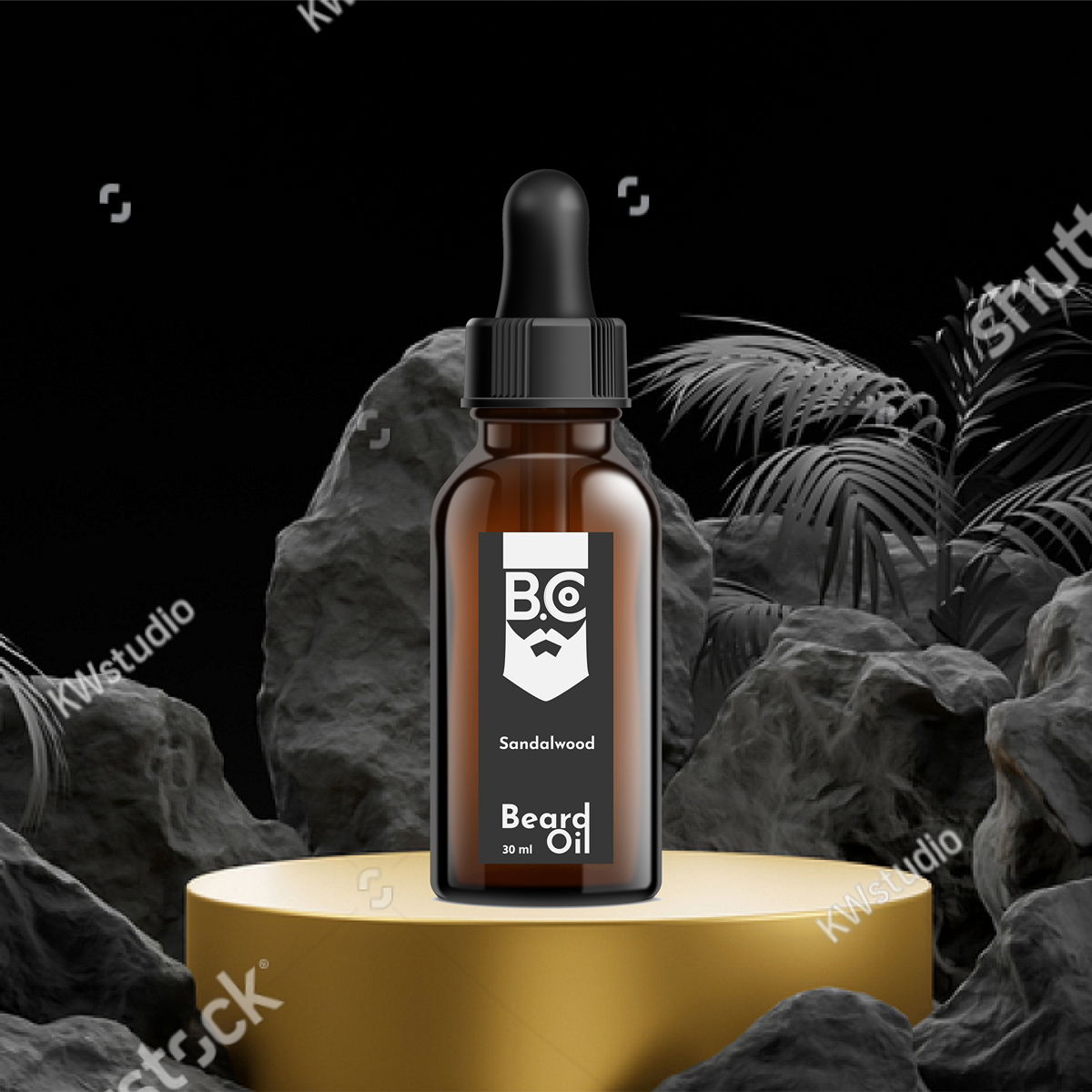
The product design for Ruggan’s range of beard care essentials, including oils, shampoos, and creams, is a testament to the brand’s commitment to blending functionality with aesthetic elegance.
Each bottle and packaging is meticulously crafted to reflect the rugged sophistication of its target user, the bearded man who values both the wildness of nature and the meticulous care of his appearance.
Bottle Design
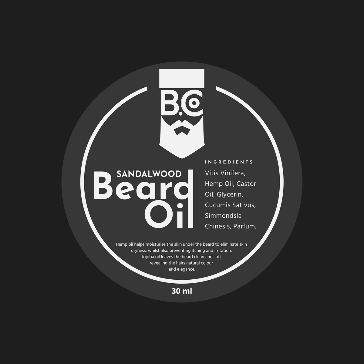
The bottles are designed with a robust, masculine silhouette, embodying strength and durability. The use of a dark, matte finish on the bottles, reminiscent of the “Midnight Canvas” (#202020), serves as a nod to the natural, earthy origins of the ingredients within, while also providing a sleek, modern look that stands out on any bathroom shelf.
The “Amber Glow” (#E86B17) accentuates key elements on the label, drawing attention to the product name and the natural ingredients, ensuring clarity and brand recognition at a glance.
Packaging Design
The packaging design extends the narrative of natural elegance and adventurous spirit. Each box, while simple in its construction, features captivating imagery of mountain landscapes and men in their natural, bearded glory, evoking a sense of freedom and connection with the wild. The contrast between the dark background and the vibrant, accent-colored texts and icons on the packaging not only makes for an eye-catching presentation but also mirrors the product’s promise of natural care and refined masculinity.
User Experience
The packaging design extends the narrative of natural elegance and adventurous spirit. Each box, while simple in its construction, features captivating imagery of mountain landscapes and men in their natural, bearded glory, evoking a sense of freedom and connection with the wild. The contrast between the dark background and the vibrant, accent-colored texts and icons on the packaging not only makes for an eye-catching presentation but also mirrors the product’s promise of natural care and refined masculinity.
Marketing Collateral
Executed the final build with an emphasis on quality and innovation.
Projects were delivered through an engaging website platform, showcasing BattleforkStudio’s pioneering vision.
From vision to reality: Launching a new era of IT automation.
Visual and Verbal Identity
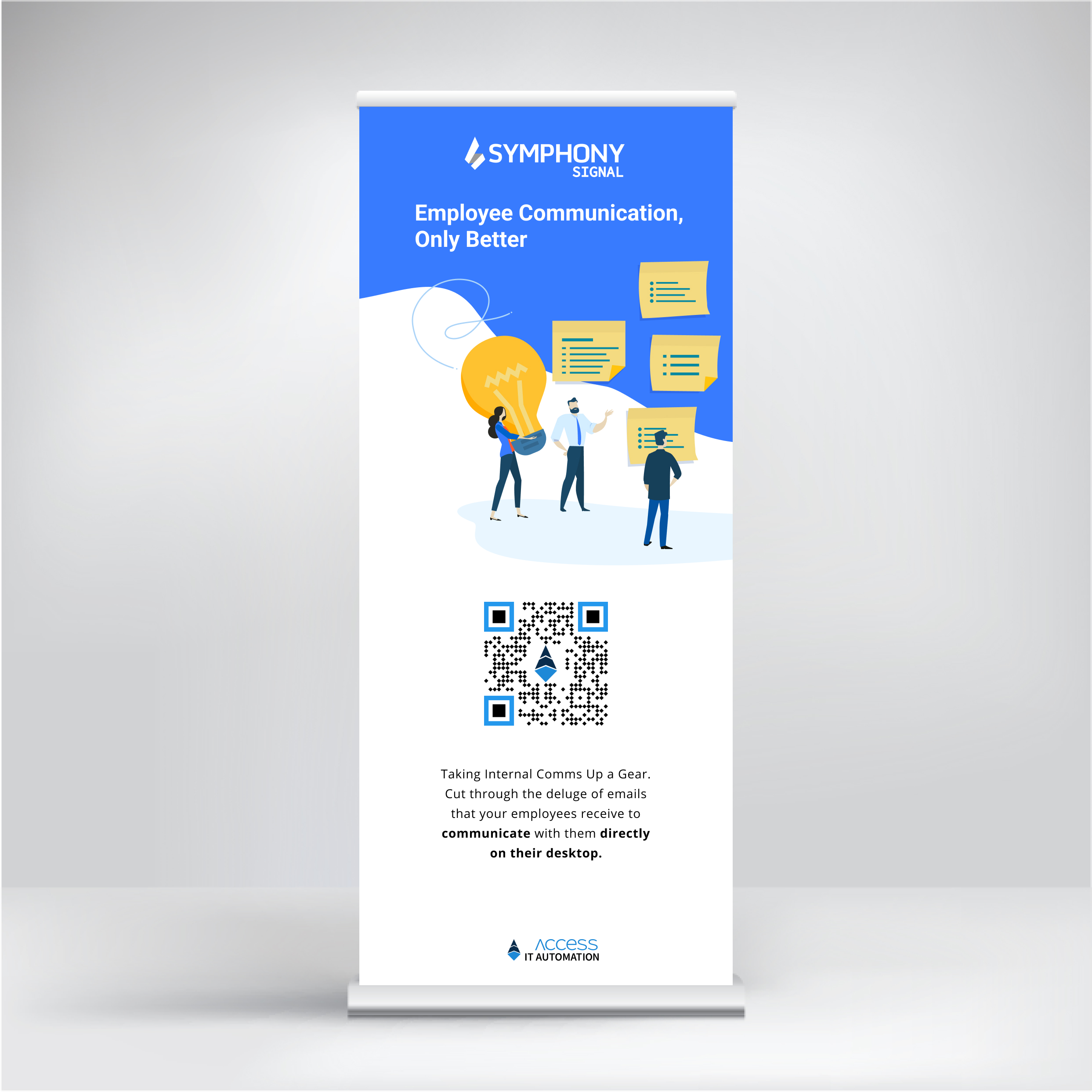
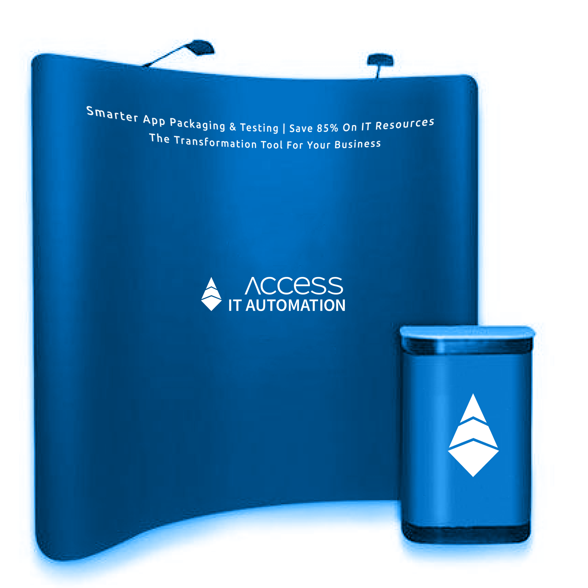
The logo and brand colors were consistently used in all social media materials, reinforcing brand recognition. Each post, graphic, and video was carefully designed to align with AccessITAutomation’s ethos of innovation and trust, with a clear call to action encouraging viewers to visit the website, read more, or get in touch.
The culmination of Access IT Automation's strategic overhaul across digital, physical, and interpersonal touchpoints led to significant achievements for the client.
Post-launch, the newly revitalized digital presence marked a substantial increase in user engagement, with website traffic surging and social media interactions more than doubling.
The clarity and accessibility of information fostered deeper understanding and appreciation of Access IT Automation's offerings, translating into a marked uptick in qualified leads.
04. Result for the Client
Transforming AccessITAutomation into a digital and market leader, one touchpoint at a time.
