Interior PrivateJanuary 23, 2023
Accessplc
Location
Lightwater, UK
Type of Project
Full Branding
Industry
IT Solutions, Talent Acquisition
Client
Access IT Automation
Key Challenge
To design a website that seamlessly marries the human-centric aspect of recruitment with the precision and innovation of the technology sector. This delicate balance needed to reflect in every aspect of the site, from its visual design to its user experience, ensuring that it speaks to both the candidates’ aspirations and the industry’s forward-thinking nature.
00. Project Description
Accessplc presented an ambitious vision: to revolutionize their digital footprint in the competitive tech recruitment space.
At BNDesign Studio, we embraced the challenge with enthusiasm, recognizing the opportunity to showcase our ability to merge innovative design with functional precision. Accessplc, a leader in providing bespoke IT recruitment solutions, sought to enhance their online presence not just as a service but as a platform for engagement and industry leadership.
Our journey with Accessplc was not just about a redesign; it was about setting a new standard in how recruitment companies connect with clients and candidates in the digital age.
The primary challenge facing Accessplc was an outdated digital interface that failed to reflect the cutting-edge nature of their IT recruitment services.
In an industry driven by technological advancement, their online presence was not keeping pace, resulting in a disconnect between their market-leading services and digital engagement.
This gap hindered not only client and candidate experiences but also Accessplc's ability to attract top-tier tech talent. Our task was clear: to bridge this gap with a digital solution that accurately represented their standing as innovators in the tech recruitment field.
Revolutionizing Recruitment in the Tech Realm
01. Research
Crafting a digital cornerstone for IT automation leadership.
Our initial phase of research involved a deep dive into the IT automation industry, competitor analysis, and current digital trends to understand the landscape Access IT Automation operates within.
Through surveys, user behavior analysis, and stakeholder interviews, we uncovered a clear need for a platform that not only informs but also engages and converts potential clients.
Insights revealed a demand for intuitive navigation, detailed service descriptions, and accessible contact channels, emphasizing the importance of a seamless user experience to foster trust and credibility among enterprise-level clients.
Based on our comprehensive research and insights, we proposed a solution centered around a complete overhaul of the Access IT Automation website.
The redesign would focus on a clean, modern aesthetic with enhanced usability features, including a restructured service portfolio, interactive case studies, and a streamlined user journey.
This approach aimed to position Access IT Automation as a thought leader in IT automation by providing a resource-rich platform for potential clients to explore solutions, gain insights, and initiate contact effortlessly.
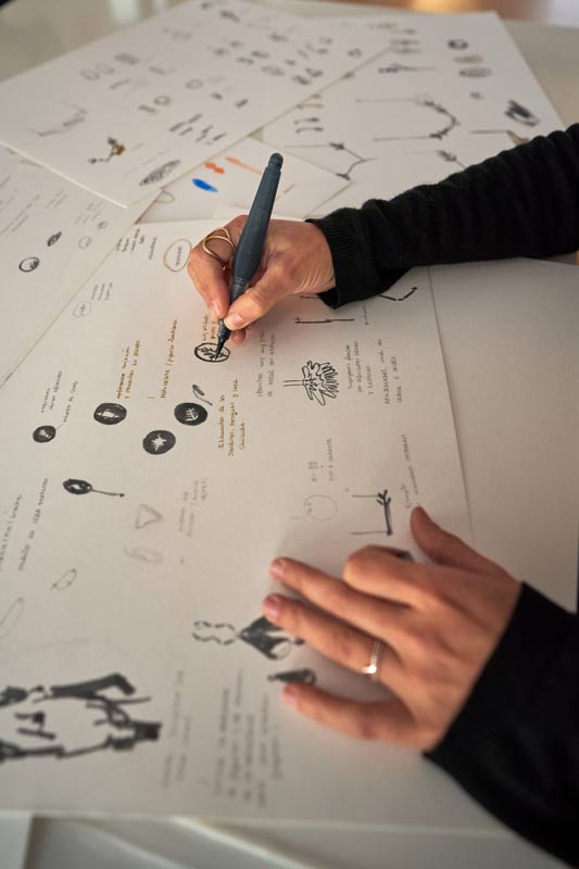


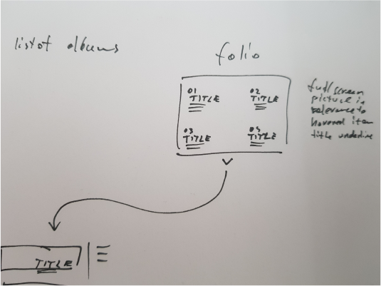
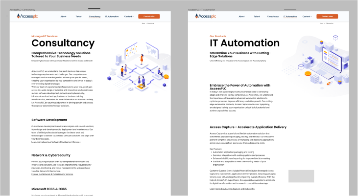
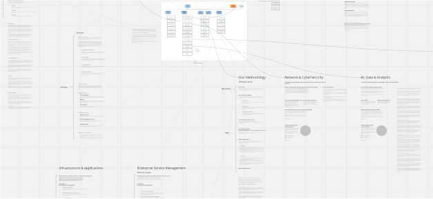
In crafting the conceptual blueprint for Accessplc, our focus was to reimagine the recruitment journey, blending intuitive design with cutting-edge technology.
We envisioned a platform that not only streamlined the connection between tech professionals and leading companies but also cultivated a community where innovation thrives.
Through a series of collaborative workshops with the Accessplc team, we distilled the essence of their brand into a digital experience that speaks directly to the heart of the tech industry.
01. Conceptual Blueprint
Blueprinting Tomorrow’s Tech Talent Connections
02. Prototype and Test
Transforming Ideas Into Interactive Realities
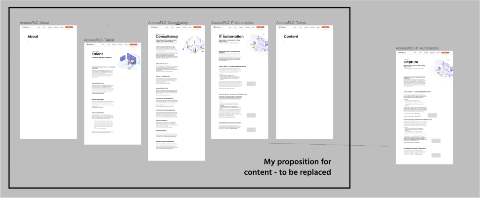
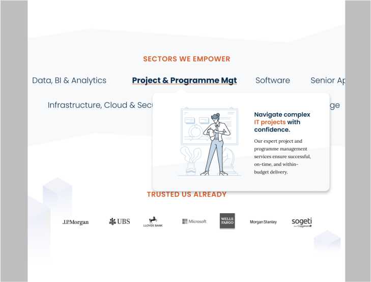
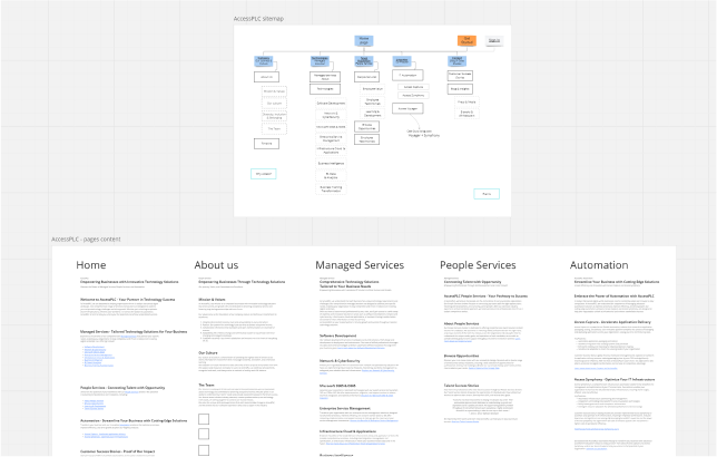
The prototype phase for Accessplc was a journey of turning our conceptual blueprint into a tangible, interactive model.
This crucial step involved creating a series of prototypes that embodied the innovative features and user-centric design principles we envisioned.
Through iterative design sprints, we developed a prototype that not only showcased a seamless user interface but also introduced new functionalities tailored to enhance the recruitment process.
This interactive model served as a bridge between our creative concepts and the practical needs of Accessplc's diverse user base, enabling us to test and refine our ideas in a real-world context.
The core solution idea for Accessplc revolved around simplifying the complexity of tech recruitment, making it more accessible and engaging for both companies and candidates.
We aimed to create a platform where opportunities find the talent, rather than the other way around. Our solution also included a dynamic content hub, designed to educate and inspire users about the evolving tech landscape, fostering a community of continuous learning and professional growth.
This idea was not just about filling positions but transforming how tech professionals navigate their careers and how companies discover potential.
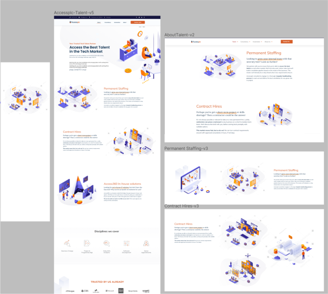
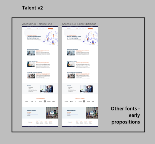
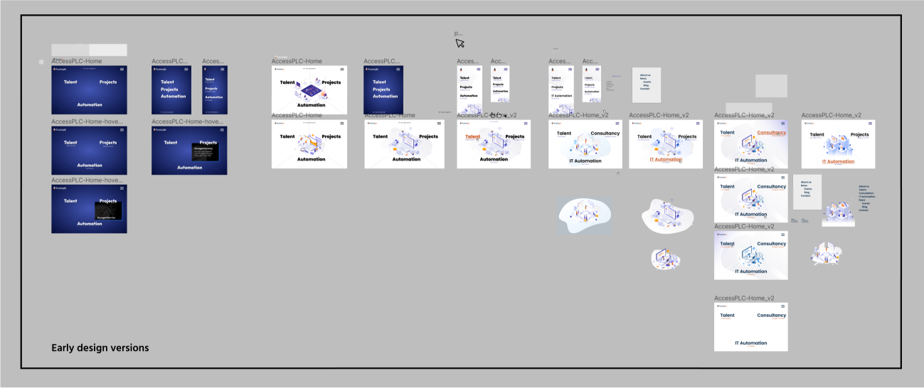
In the next stage of our work with Accessplc, the focus was on evolution through iterative design. Each iteration brought us closer to a solution that not only met but exceeded the expectations of Accessplc and its users.
This process involved meticulous testing and feedback loops with both the Accessplc team and a select group of end-users, ensuring that every adjustment enhanced the user experience and functionality of the platform.
From refining the user interface for optimal navigation to tweaking the algorithm for better match accuracy, our commitment to iterative improvement was pivotal.
This relentless pursuit of excellence ensured that the final product was not just a reflection of our initial vision but a superior version that addressed the nuanced needs of the tech recruitment industry.
03. Refining the Vision
Perfection Through Iteration

04. Build and Delivery
Launching New Horizons in Tech Recruitment
Transitioning from refined prototypes to the final build and launch of the platform.
This stage was a testament to precision engineering and aesthetic finesse, where every line of code and pixel was meticulously crafted to bring the envisioned digital experience to life.
We focused on ensuring the platform's stability, speed, and scalability, anticipating the needs of Accessplc's growing user base.
Rigorous testing protocols were applied to guarantee a flawless user experience, from seamless navigation to secure data transactions.
The launch of Accessplc's new platform was not just a delivery of a product but the initiation of a new era in tech recruitment, setting a benchmark for innovation, engagement, and efficiency in the industry.
Colours
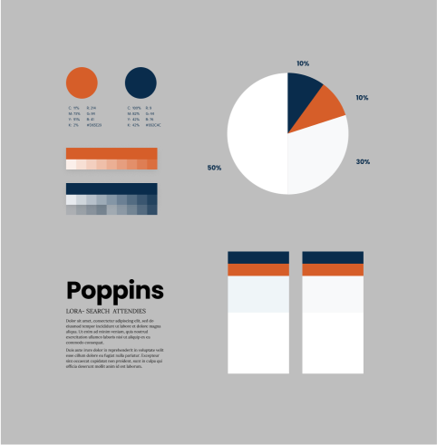
The visual palette for Accessplc’s digital presence was carefully curated to not only embody the brand’s ethos but also to enhance user experience through thoughtful color psychology.
Alongside “Innovative Coral” (#D65E29) and “Tech Navy” (#092C4C), which provide vibrant and deep accents respectively, we introduced “Cloud Whisper” (#F8F9FA), a light bluish hue that offers a refreshing breath of air, symbolizing clarity, openness, and innovation. This color, taking up 30% of the design, acts as a bridge between the energizing orange and the dependable navy, facilitating a seamless visual flow that encourages exploration and interaction.
The foundation of the palette rests on a clean white background (#FFFFFF), which occupies 50% of the design space. This choice not only amplifies the brightness and legibility of the platform but also imbues the design with a sense of purity and possibility, reflecting the new beginnings that Accessplc facilitates in the tech recruitment world.
By allocating 10% to both the “Innovative Coral” and “Tech Navy,” we ensure that these powerful colors accentuate without overwhelming, guiding users’ attention to key actions and information.
This balanced application of colors creates a harmonious, engaging, and intuitive interface, embodying the innovative and forward-thinking spirit of Accessplc.

PRIMARY COLOR
Innovative Coral
#D65E29
RGB 214,94,41
PRIMARY COLOR
Tech Navy
#092C4C
RGB 9,44,76
PRIMARY COLOR
Cloud Whisper
#F8F9FA
RGB 248,249,250
PRIMARY COLOR
Clear White
#FFFFFF
RGB 255,255,255
Logo
The logo for Accessplc is a masterful representation of the brand’s ethos, blending human-centric values with cutting-edge technology.
Designed with a sleek diamond shape, the logo symbolizes the multifaceted approach of the company. The bottom segment, rendered in a vibrant coral hue, signifies the people aspect of the business—warm, accessible, and at the heart of everything Accessplc stands for.
The remaining parts of the diamond are adorned in a distinguished navy, illustrating the brand’s commitment to excellence in technology and its robust, reliable foundation in the tech recruitment industry.
This thoughtful use of color not only differentiates Accessplc visually but also encapsulates its mission to harmoniously blend human potential with technological advancement.
Website
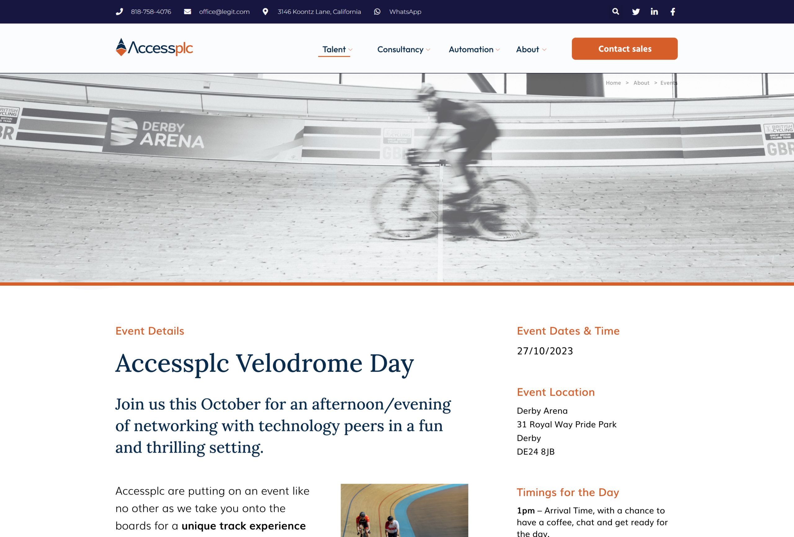
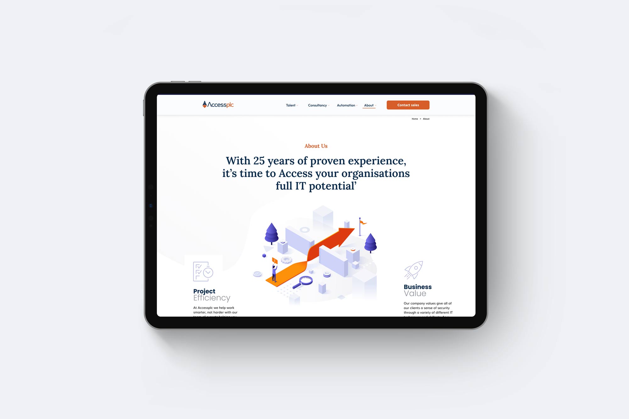
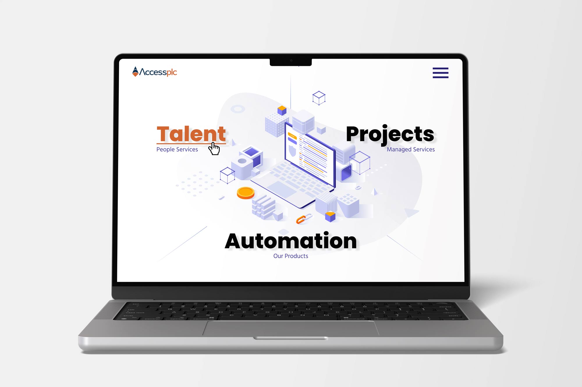
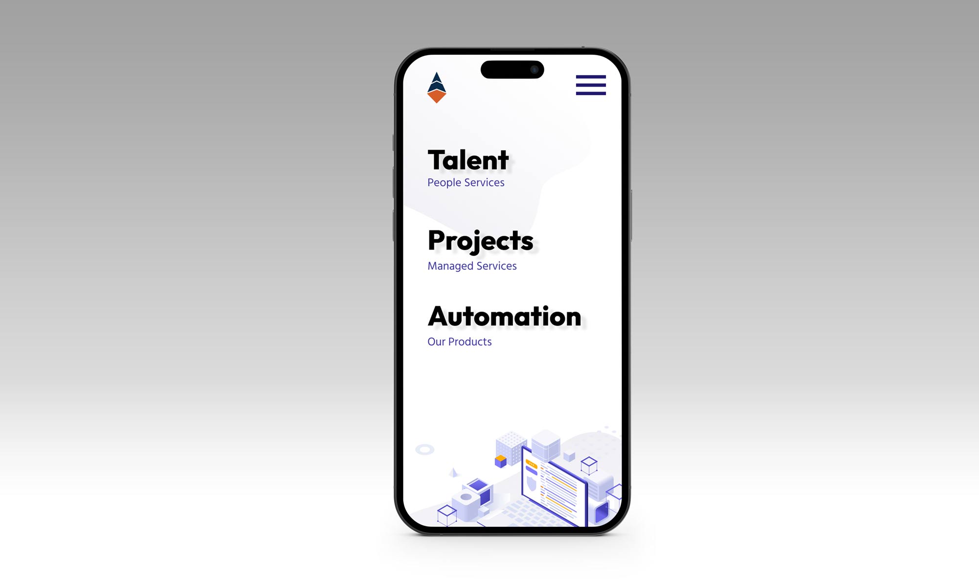
The Accessplc website redesign was orchestrated with the goal of embodying the essence of the brand’s unique position at the intersection of technology and human-centric recruitment.
The site features a clean, modern aesthetic, drawing upon the sophisticated color palette of navy blue and coral to delineate the fusion of technology and the human element.
The diamond logo, with its coral base and navy body, serves as a constant visual anchor throughout the site, symbolizing Accessplc’s commitment to connecting top tech talent with leading companies through a blend of personal touch and technological innovation.
Navigation is intuitively structured, ensuring users can effortlessly explore services, read insightful content, or submit inquiries.
Interactive elements and responsive design ensure that the website is not only a portal to Accessplc’s services but a showcase of their prowess in leveraging digital tools to enhance human connections within the tech recruitment space.


Social Media
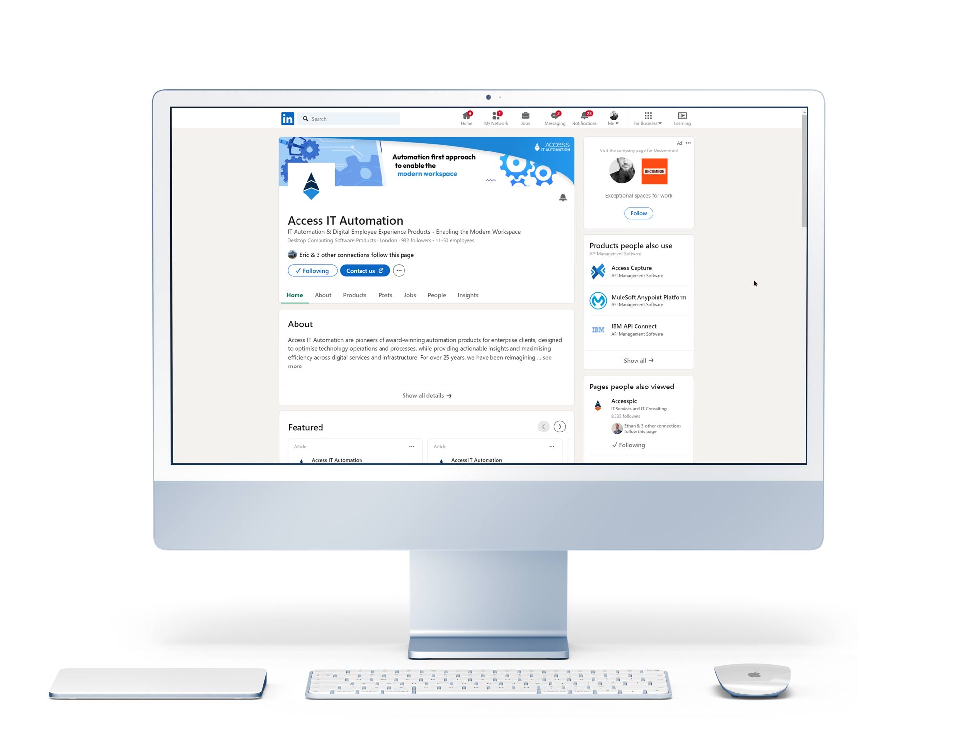
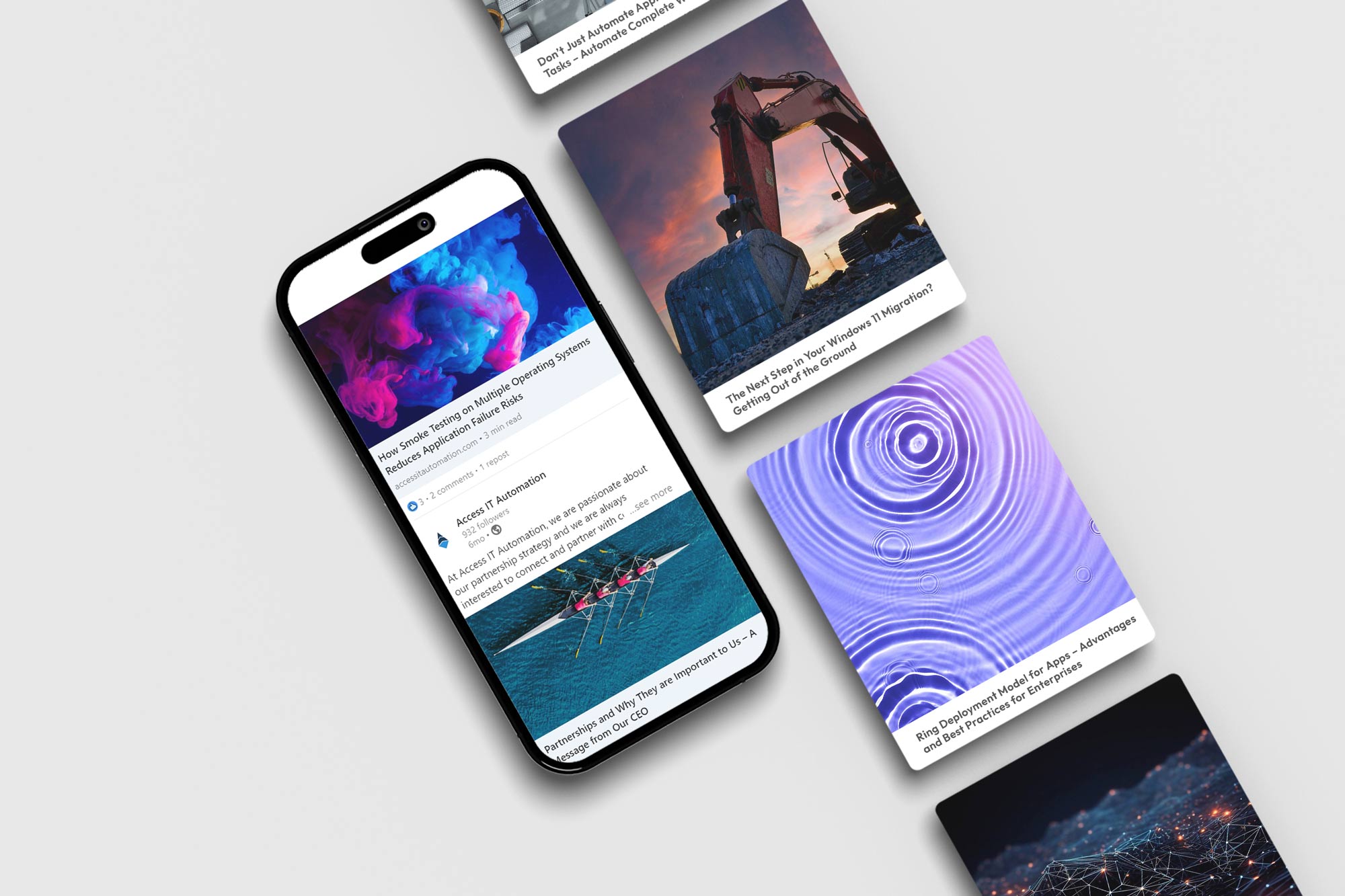
In parallel with the website revitalization, Access IT Automation’s social media materials were crafted to extend the brand’s reach and engagement across various digital landscapes.
Recognizing the power of social media in building community, enhancing brand visibility, and facilitating direct communication with clients, a comprehensive strategy was deployed to leverage these platforms effectively.
Visual and Verbal Identity
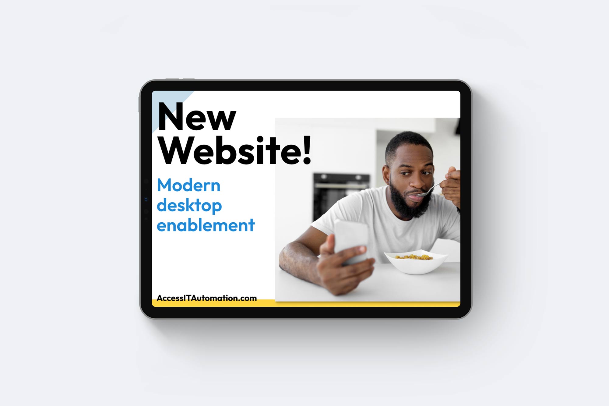
The logo and brand colors were consistently used in all social media materials, reinforcing brand recognition. Each post, graphic, and video was carefully designed to align with AccessITAutomation’s ethos of innovation and trust, with a clear call to action encouraging viewers to visit the website, read more, or get in touch.
The logo and brand colors were consistently used in all social media materials, reinforcing brand recognition. Each post, graphic, and video was carefully designed to align with AccessITAutomation’s ethos of innovation and trust, with a clear call to action encouraging viewers to visit the website, read more, or get in touch.
Marketing Collateral
Executed the final build with an emphasis on quality and innovation.
Projects were delivered through an engaging website platform, showcasing BattleforkStudio’s pioneering vision.
From vision to reality: Launching a new era of IT automation.
Visual and Verbal Identity
The logo and brand colors were consistently used in all social media materials, reinforcing brand recognition. Each post, graphic, and video was carefully designed to align with AccessITAutomation’s ethos of innovation and trust, with a clear call to action encouraging viewers to visit the website, read more, or get in touch.
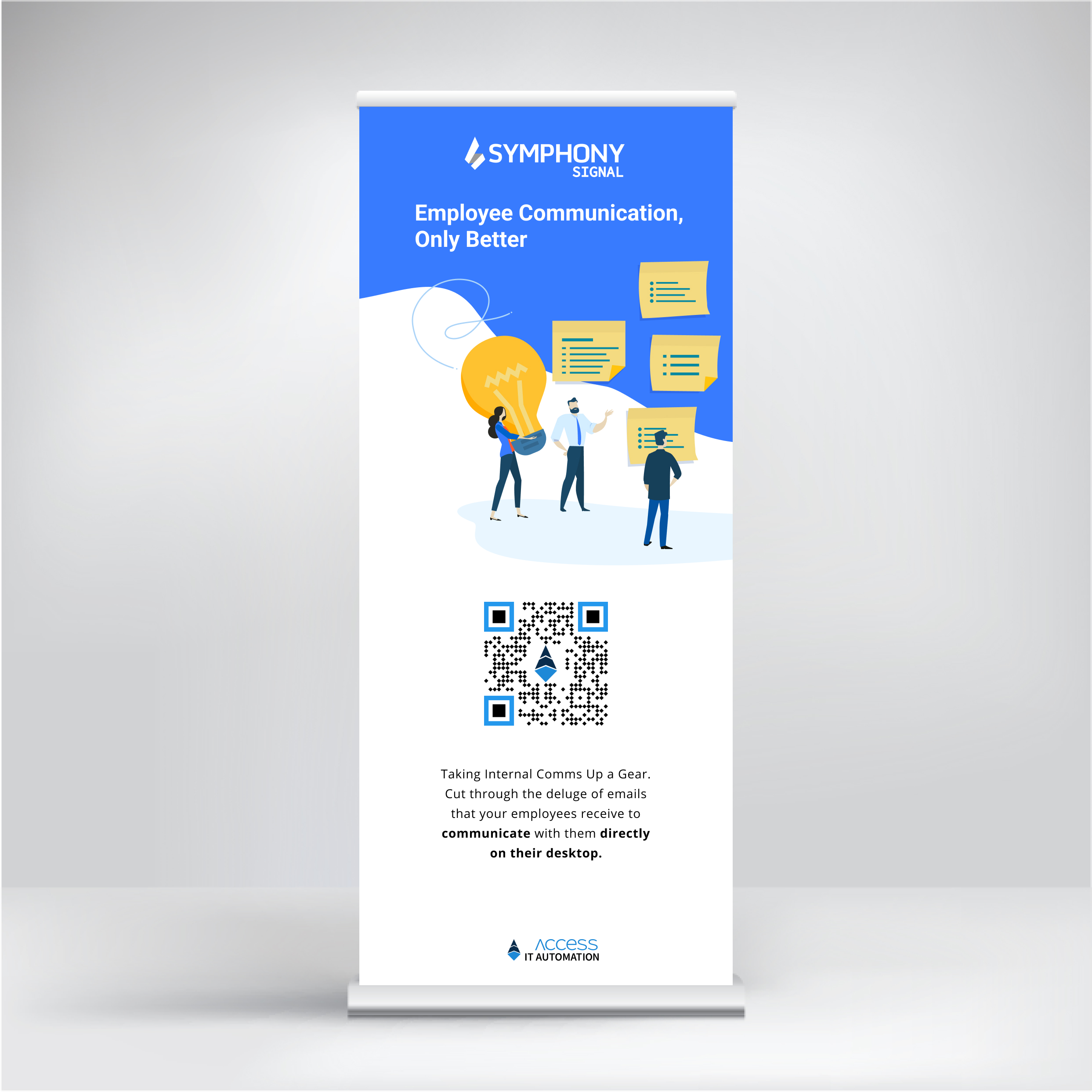
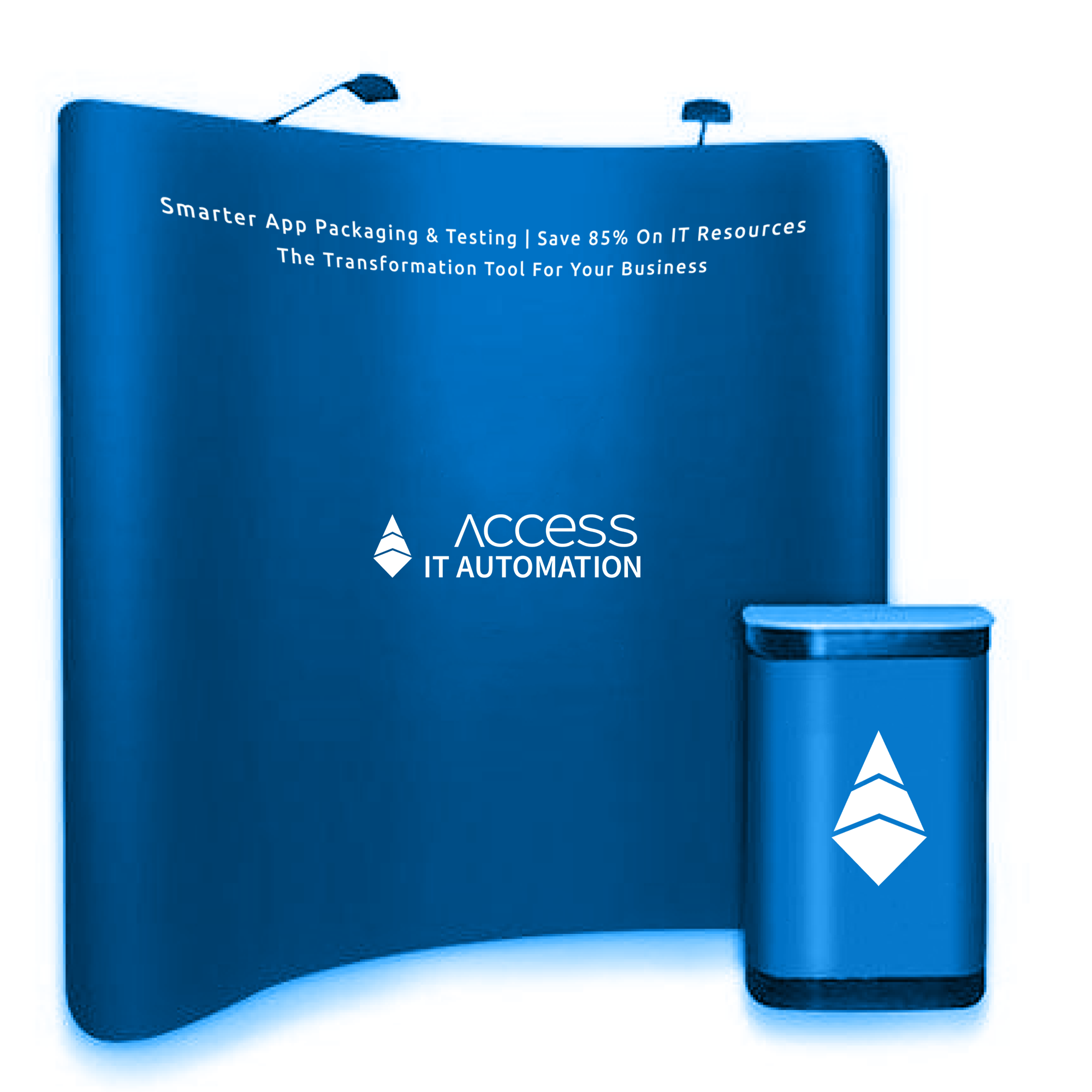
The culmination of Access IT Automation's strategic overhaul across digital, physical, and interpersonal touchpoints led to significant achievements for the client.
Post-launch, the newly revitalized digital presence marked a substantial increase in user engagement, with website traffic surging and social media interactions more than doubling.
The clarity and accessibility of information fostered deeper understanding and appreciation of Access IT Automation's offerings, translating into a marked uptick in qualified leads.
04. Result for the Client
Transforming AccessITAutomation into a digital and market leader, one touchpoint at a time.
