
Colour is an important element of web design – it can be used to create visual impact, to convey emotion and to influence the user’s behaviour. Knowing how to use colour theory in web design can help you create a website that is visually appealing, harmonious and effective. In this blog post, we’ll discuss how to use colour theory to make the most of your web design.
Why Color Matters In Web Design
Colour is an essential factor in web design and it is important to understand how to use colour theory in order to create an effective user experience. Colour theory is the study of how colours interact with each other and how they can be used to create an aesthetically pleasing design. Studies have shown that colour can influence the way people perceive a brand and how they interact with a website. Therefore, understanding the basics of colour theory is essential for creating a successful website design.
Different colours evoke different emotions and create different visual effects, and by understanding how to use colour effectively, designers can create more balanced, harmonious and visually appealing designs. For example, colour can be used to create a sense of hierarchy and draw attention to certain elements, such as calls to action. It is also important to note that different colours can have different meanings in different cultures, so it is important to take this into account when designing a website.
By understanding colour theory and how colour can be used to create an effective user experience, designers can create successful and engaging websites. By using colour correctly, designers can create a website that is visually appealing, easy to use and resonates with their target audience.
A Brief Look Into Color History.
The use of colour in web design is an invaluable tool for creating an effective website that engages viewers and conveys the desired message. Colour has been used as a form of communication since ancient times and different cultures have had their own ways of representing colour and its symbolism. In the Middle Ages, religious art used colours to convey different meanings, with the use of symbolism. The Impressionists started to use bright, vibrant colours in their paintings in the 19th century, and in the early 20th century, the Bauhaus art school developed a colour theory that was based on the psychological impact of colours.
Today, this colour theory is still used as the foundation for understanding how to use colour effectively in web design. By understanding the psychological impact of each colour, designers can create a website that is visually appealing and conveys the desired message. For example, blue is often associated with trustworthiness, reliability, and serenity, making it an ideal choice for healthcare and financial websites. On the other hand, red tends to evoke excitement and energy, making it a great choice for sports or entertainment websites.
To ensure that the colours used in a website are effective in conveying the desired message, designers should use a colour wheel to identify complementary and contrasting colours. By understanding how different colours interact with each other, designers can create a visually pleasing website that is both engaging and effective. Additionally, designers should consider the context in which each colour is used. For example, a bright, vibrant colour may be appropriate for a children’s website, but may be too distracting for a corporate website.
By understanding and applying colour theory, designers can create a website that is visually engaging and conveys the desired message. By understanding the psychological impact of colours, selecting complementary and contrasting colours, and considering the context of the website, designers can create a website that is both effective and aesthetically pleasing.
7 Key Color Theory Terms You Should Know
Color theory is an important tool for web designers. It can help to create an aesthetically pleasing and visually compelling experience for website visitors. The key to successful implementation of color theory in web design is understanding the various color categories, how they interact, and how to make the most of them.
Primary Colours are the three colours from which all other colours are made. These are red, yellow and blue. Secondary Colours are created by mixing two primary colours together and include orange, green and purple. Tertiary Colours are created by mixing a primary and a secondary colour together and include red-orange, yellow-orange, yellow-green, blue-green, blue-purple and red-purple.
Complementary Colours are those that are directly opposite each other on the colour wheel, creating a vibrant and eye-catching contrast. Analogous Colours are those that are side by side on the colour wheel, creating a harmonious and pleasing combination. Warm Colours are those associated with warmth, such as red, orange and yellow, while cool colours are associated with coolness, such as green, blue and purple.
By understanding the various colour categories and how they interact, web designers can use color theory to create stunning and effective web designs. By carefully selecting and combining the right colours, website visitors can be provided with an immersive and engaging experience.
5 Types of Color Schemes
Using colour theory in web design is an effective way to create an aesthetically pleasing and eye-catching website. Colour theory involves the use of different colour combinations to create the desired effect. Here are some of the most common colour schemes used in web design and how to use them:
Monochromatic Colour Scheme
This colour scheme uses only one colour with different shades of that colour. It is often used to create a calming effect and is best suited for websites that need to evoke a feeling of serenity.
Complementary Colour Scheme
This colour scheme uses two colours that are opposite each other on the colour wheel. It is often used to create a vibrant and eye-catching effect and is best suited for websites that need to draw attention to certain elements.
Analogous Colour Scheme
This colour scheme uses three colours that are side by side on the colour wheel. It is often used to create a harmonious and balanced effect and is best suited for websites that need to evoke a feeling of harmony.
Triadic Colour Scheme
This colour scheme uses three colours that are evenly spaced around the colour wheel. It is often used to create a dynamic and vibrant effect and is best suited for websites that need to draw attention to certain elements.
Tetradic Colour Scheme
This colour scheme uses four colours that form two complementary pairs. It is often used to create a striking and sophisticated effect and is best suited for websites that need to evoke a feeling of luxury and sophistication.
By understanding the fundamentals of colour theory, web designers can easily create aesthetically pleasing and effective websites. By using the right colour combinations, web designers can create a website that will effectively engage their audience and create a positive user experience.
How to Use Color Psychology and Meaning to Influence Emotions
Using colour effectively in web design is a great way to create an eye-catching, engaging experience for users. By utilising the principles of colour theory, designers can create a visual hierarchy that emphasises important elements on a page, evoke emotional responses, and create visual harmony and flow.
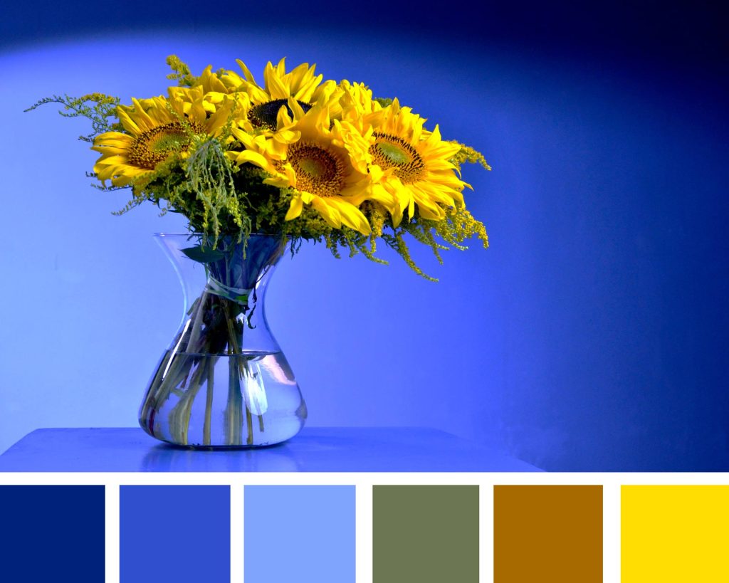
To create a bold, contrasting visual hierarchy, consider using bright, contrasting colours. For example, using a bright yellow as a call-to-action button against a navy blue background can help draw attention and make the button stand out. Different hues can also be used to evoke different emotional responses. For example, blue is widely associated with trust, while red is often used to evoke a sense of urgency.
It’s also important to consider the cultural meanings of colours when designing for a global audience. For example, white is associated with mourning in some cultures, while green is associated with luck in some Asian countries. Knowing the cultural significance of colours can help designers create a more meaningful design that resonates with their target audience.
The psychological effects of colour should also be taken into account when designing for a specific audience. For example, warm colours such as red, yellow and orange can create a sense of comfort and energy, while cool colours such as blue and green can create a sense of calm and relaxation.
Finally, it’s important to consider the physical effect of colour, such as how bright or dark it is. Bright colours can be overwhelming and uncomfortable to look at, so it’s important to balance the colours to create visual harmony and flow. It’s also important to be mindful of how specific colour combinations can affect accessibility for users with colour vision deficiencies. By taking into account the principles of colour theory, web designers can create an engaging, accessible experience for users.